K-State Theater and Dance
Illustration, typography, & layout
Posters created for the upcoming 2023-2024 season at Kansas State University’s Music, Theater and Dance program.
Exit, Pursued by a Bear
For “Exit, Pursued by a Bear,” the director noted that they wanted a composition with figures in silhouette, and wanted to show that the female figure was the one controlling the scene. The play is a dark revenge comedy, and is about a woman showing her husband how badly he’s treated her by enacting those cruelties back upon him, then leaving him covered in honey, for a bear to gnaw on. I wanted to show the titular scene, as well as hint to the dark plot of the play. I felt the red, rough texturing, and composition emphasized these components.
The Fantasticks
For “The Fantasticks,” the director wanted to utilize the existing wordmark, and then use sun and moon illustration as a backdrop. Considering this alongside the “Comedy of Errors” poster, I created a similar color scheme for this. I also wanted to keep a connection to the set/props of the play, and kept the sun and the moon held up by little strings, as they are on the stage. This poster was the most inspired by existing resources, as “The Fantasticks” has been performed for decades, and the director wanted to be sure we were referencing that history.
The Comedy of Errors
For Shakespeare’s “The Comedy of Errors,” the director wanted to bring a unique context to the classic play: 70’s cheesy sci fi. Particularly inspired by Logan’s Run and Space 1999, this composition places one set of the twins in a freer, individualistic society, and the other in a more controlled, authoritarian society. With these ideas in mind, the upper pair is inspired by Logan’s Run, and the flowy costuming in that movie, as well as the original Ancient Greek setting, including references to togas and draped outfits. The lower pair is inspired by Space 1999 and old Star Trek, the uniforming conveying stricter societal rules.
Shifting Landscapes: Winter Dance
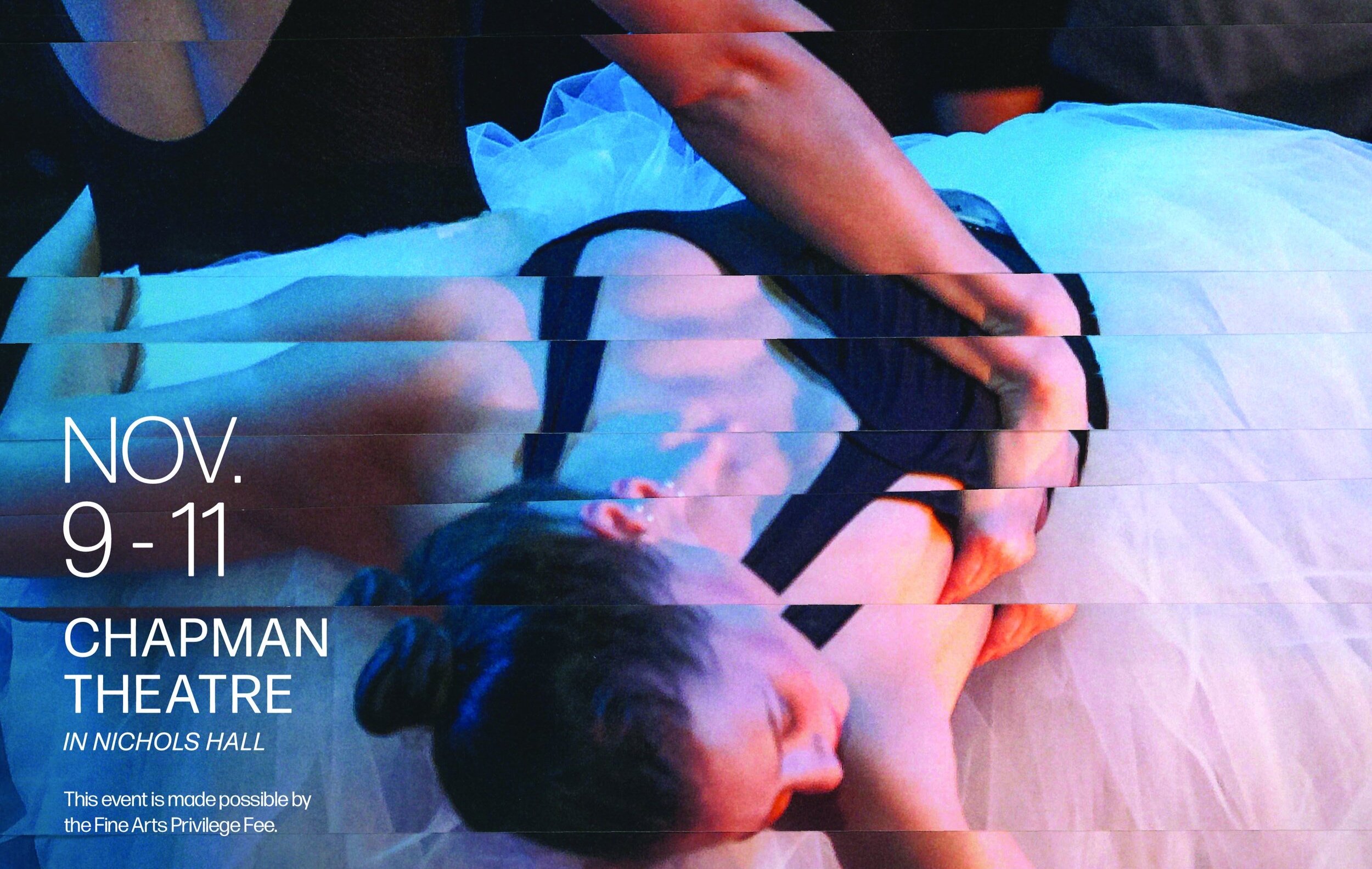
For the Dance Concerts, I wanted to emulate the gestural motion of dance, with an emphasis on the human form. I selected these photos from previous photos taken by our DCM photographers, and then printed each twice on 12x18 paper. These images were then sliced into horizontal pieces, and then rearranged to form each composition. They were then scanned back in, cleaned up digitally, and then I added the text.
Renewal: Spring Dance
This poster aligns with the Winter Dance poster thematically, and intends to display gestural motion, while creating abstraction through the choppy slicing of the image.